|
 08-22-2008, 03:12 AM
|
#21
|
|
Older King Coll
In-Game Name: Dark_Knights XXTheDarknessxX Xx_Acid_Burn_xX Haxl33twtfBBWFTW
Current Level: 50,16,13,2
Server: Teva
Posts: 532

|
Poor C. i thought it good since it green seasion love whanted.
|

|
|
|
08-22-2008, 03:41 AM
|
#22
|
|
Bat
Tournaments Won: 2
In-Game Name: FredWeasley, EishunKonoe
Current Level: 3x, 8
Server: Teva, Epith
Posts: 305
|
lol. The last one would be autowin if you could vote for it XD
__________________
Currently on the NA Mabinogi

Thank you Loveless for the awesome siggy 
|
|
|
|
|
08-22-2008, 04:58 AM
|
#23
|
|
Goblin Swordman
In-Game Name: yummy
Current Level: skewl
Posts: 463
|
Originally Posted by Lexaeus

|
|
lol. The last one would be autowin if you could vote for it XD
|
ditto 
__________________
-------------------------------------------------
Primum non nocere
-------------------------------------------------
|
|
|
|
|
08-22-2008, 06:42 AM
|
#24
|
|
Touch all the butts
|
i liked f and a and i dun like the last one its good but it doesnt mix
well with fiesta fans color scheme.
|
|
|
|
|
08-22-2008, 08:48 AM
|
#25
|
|
Where shall we wander?
|
On second thought, I voted for *.
Just noticed something.
Last edited by Ivramire; 08-22-2008 at 01:41 PM..
Reason: not supposed to say? o_O
|
|
|
|
|
08-22-2008, 09:17 AM
|
#26
|
|
Mini Greenky
In-Game Name: Anrie
Current Level: Hawkarcher lv8X
Server: Bijou
Posts: 93
|
Voted for 'F' too  (Becos i noticed something too)
__________________
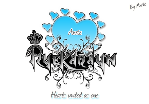
Bijou - Scout - Anrie
Guild: Ryekarayn
|
|
|
|
|
08-22-2008, 01:35 PM
|
#27
|
|
Super Moderator
In-Game Name: Espei
Posts: 8,305
|
Saying who you voted for seems to defeat the purpose of anonymous voting. Lol... might just be me. O__o
|
|
|
|
|
08-22-2008, 02:10 PM
|
#28
|
|
Ancient Stonie
Tournaments Won: 2
In-Game Name: College
Current Level: College
Server: College
Posts: 865
|
Lawls @ the last one. But 'G' is really vibrant and eye catching.
|
|
|
|
|
08-22-2008, 05:54 PM
|
#29
|
|
WHOOOOOOOOOOS THEEEEEERE!
Tournaments Won: 2
In-Game Name: Same as above
Current Level: Manzcar sndy| Elijaz 2x
Server: Teva
Posts: 824
|
I believe the last one show a real genius and I sense the artist is trying to bring forth their feelings, fears, ambitions to the forefront using a minimalist view point. The minimalist movement was first felt in the 1950’s and 60’s and exploded on to the scene leading to pop-art and Campbell soup can paintings. The artist here is intentionally removing his (or her) own personal expression to achieve a simplicity in both its form, content, and meaning. This allows us as the audience to view the piece more intensely because the distractions of color are actually removed.
People have said that minimalism lacks passion, but not here the anger and the angst the artist feels shines through clearly. You can feel the artist’s intensity in feeling and intentions with the use of hard dark strokes that blanket the canvas in such a way that brings the heart and soul of how the individual feels.
Like Newman’s “Zip†paintings the use of only two colors here brings out the theme of good versus evil in such a way it leaves nothing to chance. You are either on the same side as the artist or his (or her) enemy. If nothing else a piece like this could bring back the minimalist art in a whole new way… a better way… a way with feeling and meaning.
__________________
LOKI Thanks!!
|
|
|
|
|
08-22-2008, 06:21 PM
|
#30
|
|
oh look! nvm!
Tournaments Won: 26
In-Game Name: Rofellos, Lithon_Jr
Current Level: 7x, 4x
Server: Teva
Posts: 386
|
|
Originally Posted by Hraesvelg
|
I rather favour the last one, myself. Its quite beautiful in its stark, minimalist presentation. Colors are pretension that the artist obviously eschews. His use of an almost spraypaint-like site name shows that, while he is obviously gifted in fine art, he is also a man of the people. The urban influence that lettering lends to the piece is exquisite.
He also chose to connect with the target audience, internet users. He is obviously fluent in their language, as "OMG IT ROXXORS" merely returns a hit for "it" in the old Oxford English Dictonary. He's on the bleeding edge of the youthful mind.
He also shows disdain for the established art community by making the button names be non-aligned. The artist doesn't adhere to some stuffy brand of elitist art snobbery and the slogan "Too much empty space!" obviously refers to the empty space at the soul of every artist. This piece will never be a banner for this site because it should be in a museum!
In conclusion, Suck it FiestaHQ.
|
|
Originally Posted by Manzcar
|
I believe the last one show a real genius and I sense the artist is trying to bring forth their feelings, fears, ambitions to the forefront using a minimalist view point. The minimalist movement was first felt in the 1950’s and 60’s and exploded on to the scene leading to pop-art and Campbell soup can paintings. The artist here is intentionally removing his (or her) own personal expression to achieve a simplicity in both its form, content, and meaning. This allows us as the audience to view the piece more intensely because the distractions of color are actually removed.
People have said that minimalism lacks passion, but not here the anger and the angst the artist feels shines through clearly. You can feel the artist’s intensity in feeling and intentions with the use of hard dark strokes that blanket the canvas in such a way that brings the heart and soul of how the individual feels.
Like Newman’s “Zip†paintings the use of only two colors here brings out the theme of good versus evil in such a way it leaves nothing to chance. You are either on the same side as the artist or his (or her) enemy. If nothing else a piece like this could bring back the minimalist art in a whole new way… a better way… a way with feeling and meaning.
|
i feel you guys...
one thing straight...
THE LAST BANNER IS TOTALLY AWESOME!!!!
need not to say more about it... LOL!
if only its possible that the last banner could be applicable ONLY to me everytime i log in, i would be so glad...
but yeah...i still voted for the "teeny" banner. 
__________________

G____G Member Signature courtesy of Yosei! <3
And I also want you to visit Rofelandia. Thanks! lol
G____G Antics...
|
Originally Posted by Ralath
|
What are rolling pins?
Bowling pins?
|
|
Originally Posted by Hessah
|
|
-come feel stupid with me ralath-
|
|
|
|
|
|
Currently Active Users Viewing This Thread: 1 (0 members and 1 guests)
|
|
|
 Posting Rules
|
You may not post new threads
You may not post replies
You may not post attachments
You may not edit your posts
HTML code is Off
|
|
|
All times are GMT. The time now is 10:26 PM.
Design by Vjacheslav Trushkin, color scheme by ColorizeIt!.
Powered by vBulletin® Version 3.8.6 Copyright ©2000 - 2024, Jelsoft Enterprises Ltd.
| |


 Linear Mode
